Tuesday, June 8, 2010

Review: The Clock Maker

Heyo readers, Cody here with a Quick review on a comic called "The Clock Maker" written by Jim Kruger and art by Matt smith, Zach Howard, Michael Halbleib, Brett Weldele, and Guy Davis. Holy crap, that's a lot of people for one comic book. Oh wait, there are more people that didn't matter enough to make the cover so I won't bother with the rest.


The first thing I'll point out is how freaking amazed I was when I pulled this comic from its plastic sleeve. It looks like a rather thick comic and if you flip the comic over it says on the back "The clock maker #2" meaning this is a double issue. Alright, so I opening and Whoa, wait, what the hell? The comic unfolds into a huge comic book and is read more like a newspaper. Also to my surprise is that the duel issue is only a single issue. So why put "The Clock Maker #2" on the backside? I don't know. I guess it was just a really bad add.

Ok, so "The Clock Maker" is about a old man and his son that work on a giant clock hidden within a hollow mountain in Switzerland. But when something goes wrong and the clock (or something) lets a demon break free from hell, it hunts down dear old dad and murders both father and son.

The story picks up with his daughter, a late teens girl that was forced to live in America for most of her life due to her father and mother shipping her to her foster parents for some reason. Well she has to go back to Switzerland and bury her brother and father while confronting her mother who happens to be senile.

Once arrived in her homeland she is taken to the hidden clockwork in the mountain's. She is stunned to learn that she has become the new owner of this badass cog system of mass portal-opening-demon-releasing-clock.

With the story out of the way I must say, what the fuck went wrong? It's like Krueger just said to his group of artists, "Hey um, guys? I kinda ran out of toilet paper in the bathroom and all I had with me was the script for the book. So, your going to have to work around the brown stuff. Oh and we are missing page 4."

This may sound sorta dumb and harsh but if you read this comic you'd know what I'm saying. It seems like while he was writing he just said "Screw it" to all writing skills and just played Pac-Man instead. There are a number of times where the people are talking and then just go stupid for a sentence. Like here is a exact speech bubble for when she gets off the plane and sees her mom and some guy taking care of her. "I do not approve of your... what I'm saying is that your... is not appropriate for..." and then he walks away. At one point I thought to myself oh well maybe the writer was from Germany or was trying to go for a Swedish accent on the characters. But a little reading on wiki showed me that this was a Image comic written and inked in America.

Now, the comic can be understood and can be read through just fine, after you read it twice, but who wants to do that? Also the death of the father and son are just out of place. Like one second his father and him are running from the demon and then the father says go on without me and then teases the demon to get him to chase him instead of his son. But in the next panel the son runs and then finds puddles of blood leading to his dad, Um what? His father ran off in the other direction, but I guess it don't matter up is down and down is up. The son dies after he finds his dad, just in case you wanted to know.

Art:

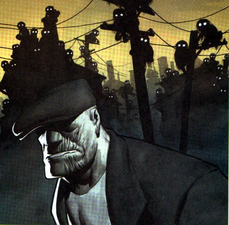
The art in the comic is sorta like the Hellboy style, sort of a chalking inking with faded colors making it light on the eyes and good for setting a dark mood but this comic fails to grab you in any style convincing ways and just falls short, the only the that I liked about the art was the comic itself, and I don't mean the ink I am talking about the shape of the comic (as described at the start of the review).

Writing:

The writing is poor due to it being slight hard to understand whats being said why people talk in stupid ways at times and fail really hard on telling us who everyone is. I don't have any idea who the guy helping her out and showing her the clock even is. Just confusing.

Story:

The story makes barely any logic at all and tosses names of people out into the air left and right yet are never spoken of again. Just like Lost we get a ton of questions and barely any answers.

See now I wanted to like this comic a ton, I loved how it flips open into a newspaper style and is like a giant comic book, though it did make it hard to hold and hard to flip pages without the staples overlapping and creasing the pages slightly. I wanted to recommend it so bad but I can't this comic was ruined from the start, it is interesting and I would like to finish the series but due to how strange it was and the newspaper style the comic failed to sell to the normally comic book fans and doomed the comic before the final third issue was finished and put out, so even if you bought it and enjoyed it, you'll never get the ending you want to see. Like Lost.

I give The Clock Maker a sad 2 out 5

Cody~Out.

Wednesday, June 2, 2010

Review: The Goon

Sup guys and girls, Cody here with a review of "The goon" series. Um, sorry it's such a huge post.


The reason I am reviewing it as a "series" and not a issue or graphic novel is because I recently went to my local Bookmans were Tim and I noticed that all comics were 50 cents each no matter what the comic was. The first comic I noticed sticking out of a long-box was The Goon issue #26. I had known about this series for a number of months now and wanted to check it out but was always stopped due to it being rather hard to find issue #1. Well I was lucky to find a slew of issue going all the way back to issue #3 original print too. But they were not in order, I found #3, #12, #16, #19, #22, #23, #25, #26/26 (same issue but different prints) #27, #29, #? This one was strange. It was unlabeled in the time line. its a full color high print and a first edition at that, it was labeled as a 25 cent issue instead of a number. It was the first one I read outta the bunch thinking it was possibly issue one. I was wrong but in good way. Issue "25 Cents" is what I assume a Issue to help people lost in the series find out whats going on.

The Story:

The story is about anti-hero The Goon and his sidekick Frankie. The goon is the right hand man of the biggest "boss" ever to rule the city. I couldn't seem to find out what he was in terms of being a boss so I just made the guess of him being a mob boss, but without the mob. Um, yeah. Or a hard core loan shark.

Anyways, Goon and Frankie are highly feared in the city by the living and the undead. Anything that the boss Labrazio says for them to do, they do it. And like most mob story's one boss wants the other dead, so they send their men to attack Goon seeing how he is the only one who has full contact with the boss. Only to reveal that Goon killed the boss in issue #3 and has been hiding this fact for over 20 years.

There, now that you know the story I gotta say, it was rather hard to explain that without just saying, "The Goon rules the streets and everyone is scared of him". I feel a strong need to talk a little about the Goon and his half pint sidekick.

The Characters:

The Goon Is a huge, thick jawed, short tempered, little worded anti-hero. I love this guy, he is the perfect build and style for when I think of anti-hero's from the time era given to us, which I think is somewhere between fictional 1850-1920's. He is the strongest, baddest mug and if you mess with him he will bust more than just your jaw in a single punch. His style of clothing suits the era and build perfectly making him look like a badass as well and someone that would be fun to drink with at a bar. (Odd way to phrase that if I say so myself)

Frankie, oh man. This guy is just insane. I don't think anyone other sidekick would have worked. Any other choice would have just been stuck in the hero's shadow, But Frankie? Hell no! Frankie jumps at the chance to make you remember him whenever you think of the Goon. Making himself noticed at times of pure silence, with acts of bi-polar love/furry like the heart touching vampire that was beaten nearly to death (ha, funny because the pun of, vampire, being, dead.. shut up) by the Goon and Frankie yet stands to help the Goon in time of need! To which Frankie responds with a heart filled Thank you, and "Knife to the eye!". Frankie's short temper and over abusive life style really grabs you by the hair and screams "LOVE ME!"

Eric Powell does such a good job on these characters that I even liked the sub-story with the Goon's foe about reviving a human head to figure out information on The Goon's boss.

The Writing:

Eric Powell did such a fantastic job writing this comic, he really brought you into the era and made you enjoy everything being said and made you feel at home. The characters never feel out of place or stale, with new foes and new plots, the story seems fresh after every issue and leaves you wanting more. Like I said above I even enjoyed the villain talking to his zombie butler about reviving a human head for information. None of the writing feels dull or phrased in a strange way, just perfect.

The Art:

The art in this comic really stood out to me, but not at first. I had walked right by this comic a number of times while at Atomic Comics while thinking "I really wish I could find the first issue so I could review that" but I never saw it as to much of a reach out, so I let it be. Once I got a hold of these issues though, I noticed that my choices of not searching hard enough was a wrong one. The style changes every few comics but really holds onto your desire of the comics. I can't really put to much detail into how it all looks because how much it changes. One thing never changes, the way the color is. It is always bright and eye catching, thick to the tip. Eric Powell doesn't do his own color (all the time) but his drawling style always stays the same so when the inker changes the color style it always flows perfectly because it still holds his style. Lovely.

The ink is mainly heavy with bright yet muted coloring, making it perfect for pop-out-combat. From issue to issue I grow more and more into enjoying the style changes that take place in the color and outline levels.

The final say on the comic is a must read. I highly suggest this comic, might be better if bought in the graphic novel section though.

I give The Goon a 4 outta 5.

Cody~Out