Aliens VS Predator.
Hi, my name is Cody and this is my review for Aliens VS Predator. I played it using the Onlive service, over the ear headphone for the best sound and a xbox 360 controler.
Marine Gameplay: At first the way I was moving felt strange and slightly foriengh to me, RB to hit, LT to fire secondary shot, Y to heal. Even the way you control the motion of your player just felt a little off. After about an hour of playing it all become second nature and felt correct. But as most people know the first hour of a game should tell you most of how it is. Once I warmed up to the strange feel of the game I found myself really knocking the aliens back and fighting them without mercy. Every minute that passed I found myself enjoying the game more and more. I played the Marine chapters for a couple of hours and wasn't even close to being bored with it but I still have to play as the Aliens and the Predator. I called it quits and stepped into the Alien mode.
Alien Gameplay: For some reason the alien controls seem easer to use than the Marines was. I do feel like it take a few to many hits to kill your standard human but it is a lot of fun to climb along the top of a ceiling, drop down behind a human and bite his skull open. Something oddly satisfying about that. Sometime while running along the top of a ceiling I do find myself getting confused or disorientated. It just bends my mind going from right way up to upside down then back to right side up again within four seconds. Yikes. Another annoying thing that I noticed was when you are hunting down the Marines, they repeat the same lines over and over again. "Don't let your guard down, marines" I had that sentence said while I was hunting a small group of them at least thirty times in about ten minutes. After nearly 2 hours of playing as Number 6, the alien, I am calling it quits and trying out the Predator. (for some reason I feel like there is more of a story with the Alien than the humans. At least I can say the pet alien has a name.)
Predator Gameplay: I cant choose whether I think the Predator game play is the best or if it's the Marines, but either way, the Predator game play is bad ass. I love the way it handles. Jumping long distances and killing off tons of aliens and humans is just great. The hits are about the same as the aliens, I wish they could hit harder but it is still just light enough to make the game fun and challenging. The light hits keep you from being a fool and playing the game as a run and gun, so you are forced to play it as a hunter in the Predator life style. Kill only when you need to and collect the trophy's as you go. I loved the way the controls were set, it didn't confuse me or make it awkward for me at all. I felt like when they were making the game they put most of the focus on the Predators mechanics, and for good reason.
Sound design and music: I love the idea that the radar makes the same sound as it did in the second movie, but I think they could have changed this a little bit to make it cool and not the most annoying thing in the game. A simple adjustment to make the radar emit noise (Blips and beeps) only when you are near a alien would have made it nice and just like the movie, but no. The annoying beeping never stops, never. Other than that, the sound in this game is fantastic! I found myself on the edge of my seat while playing as the Marine, the sounds the aliens make, the sounds of the guns, even the next to silent ambiance in the game really dug deep in my mood and really set things right in the game.
Gameplay: The layout is very linear and can force you right into the traps in the game but, I still tried to find other paths to elevators and exits only to be forced out the correct way. Regardless, the path they lay out for me to walk on has me tense and unready for what they throw at me. At one point I got confused and started walking around a building till I got a glimpse of a blood splatter from a predator, it had me on edge, knowing there was also Predators lurking in the world.
Environment: This game really brought the same great feel that the movies brought. I really found myself at awe while looking at the world and textures. The way the building at the hive goes from dark and metallic to cold, wet and slimy in just a few steps really made a impact on me. In most games that kind of thing gets lost to the player and just makes them feel like they entered a new area, but for this one; I found myself interested at the fact that behind the slime and organic growth on the walls is the same metal plating as the rest of the buildings. The swamps were fun to be in and the over whelming fear that there might be a Predator on my back drives me to keep pushing out of the area. The Alien's game play area in the start felt like a testing area. It all felt the way it should have.
The things I liked most about the game was the way it made you feel. The sounds and view you get in the game really just set in with me.
The things I didn't like about the game was the annoying constant radar sound in my ears and the strange vertigo I got while playing as the Alien. I also would have liked to have known who the Marine was a little bit more.
Bottom line is: Aliens VS Predator is a very fun game and well worth the dirt cheap price you can get it for nowa days. I got the game for $5 on a onlive $5 Friday, I know you can get the game for the same basic price from like gamestop for xbox 360/ps3 and I suggest that if you are a fan of the Aliens films, you go find a copy next time your out and about or buy it Onlive and challenge me to a online VS match.
Gofio
Gofio is a small Indie company made by Cody Reader And Tim Senzee. Cody makes 3d animations, he writes comic book reviews, movie reviews, and game reviews. Tim will be making music soon so be on the look out for some of his beats. We try to make a weekly post so keep checking in often, or you could add Cody's twitter/facebook page!
Wednesday, August 10, 2011
Aliens VS Predator
Labels:
Aliens VS Predator,
headphones,
Lagthis.com,
onlive,
ps3,
sandwhich?,
xbox 360
Thursday, April 7, 2011
The world ends tonight.
Posting the best content ever?
Nope but maybe someday! Sorry guys but I'm not writing up a new comic review because I just haven't had the time lately. I have been hella busy at work, home, out with Tim on new filming projects. Which is where I'm swinging this curve ball too.
http://3blackpanels.blogspot.com/ Tim and I's new blog page purely for our film talk. Click on over and Take a look for more info.
Epic stuff huh? Oh and If my reviews of comics is really that fantastic and what not, I still do request's. Artistcode@aol.com for it guys, I'll hit the comic you choose and bring it right out.
Labels:
Cody Reader,
combic book review,
comic,
comic books,
comix,
DC Comic,
Gofio
Sunday, October 3, 2010
Simple update.
Hey guys and girls! Cody here with a update on why I haven't posted anything in nearly three months.
Firstly, I got married on September 19th and was on Bre and I's honeymoon for another week from there. So for all that I was knees deep in wedding stuff and yes it all went well and everything is still going well. Here is a picture of us!
i just finished reading a graphic novel called Locke and Key. A truly Amazing comic book and though I'd like to write a review on it I plan on skipping it for now but might go back to it later.
The reason why I am choosing to skip it? I need the writing time for writing the script for Tim and I's newest short film, "Burns the Goner" It's a short film about a middle aged man whose whole life has been given to God in his catholic lifestyle, but a spark happens and causes him to split into two personality's, one being a god fearing man, and the other a suicidal atheist. Widget in the sidebar for more information.
In case you missed it, Real: Documentary of a superhero has been finished for some time and we are trying to enter it into a few festivals. Here is the link for the video. http://www.youtube.com/watch?v=Alk9mEYlk54&feature=related
Monday, July 5, 2010
Review: BatGirl
Heyo, Cody here with a short review on "Batgirl: Dream House" written by Dylan Horrocks, Penciller Rick Leonardi, Inker Jesse Delperdang, and Jason Wright doing the coloring.
Firstly I want to say this review will be rather short due to the fact that I read this like three weeks ago and have been unable to write this till now.
Story: The story to this one is that a killer is on the loose in Gotham, with a heavy trademark of leaving his victims in open places with full body makeup and posed perfectly as human dolls. All of his victims are big name models as well to further perfect his image. Batgirl catches wind of his killings and see's it as a personal vendetta to bring him to justice. Batman ask's her to back off the case but she chooses to avoid his advice due to thinking she may know the killer from her pre-Batgirl life.
Drawing: The drawing in the comic feels like the perfect Batman style. It draws out like a traditional comic that fits into Batmans perfection. Though I was never a big fan of the Batman comic books, This one has the same basic style but seemed to really bring me into it's stylized world.
Color: The color I think is what really brought me into the art style. it was perfect to match the art work and even better for setting the overall dark tone of the book. Sadness and regret. The color pallet makes up of purely dark colors and heavy shadows. None of the colors go to far above a light basing, a single coat of paint, if you agree to that saying.
writing: The writing in the book really would just flow perfectly, you'd never stutter a word in your mind or misunderstand what was going on. You can tell that the Writer wasn't just thinking about the money in terms of greatness. I became interested in this comic over the hand full of other Batman comics I have simple for the writing. it just felt, right.
I give Batgirl: Dream House, a pleasing 4 out of 5, and a reconmendation for you to pick it up.
Cody~Out.
Labels:
Bat girl,
Batgirl,
Batman,
Cody Reader,
comic book review,
comix,
DC Comic,
doll,
dream house,
Dylan Horrocks,
Gofio,
Jason Wright,
Jesse Delperdang,
review,
Rick Leonardi
Thursday, July 1, 2010
Review for "We will bury you"
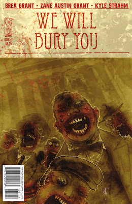
We Will Bury You. Oh, how I had high hopes for you. I will try to keep this one short. Written by Brea Grant and Kyle Strahm. Art by Zane Austin Grant.
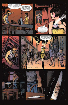
Story: The story on this one is about a woman (Mirah) and her husband (Henry) living in a city full of zombie and only females are able to walk among them because they don't like females? Wait no that can't be right. Oh, so in the start a girl is walking through a city full of men that were poorly drawn and look like zombies but are not zombies. So the story is about, wait.
Okay this comic is about a woman that works at a club where the girls dance with men for a fee, kinda like a strip club only with their cloths on. Well as she is working there her manager pulls her into the office and yells at her for slacking in her sales. She brushes him off and goes back on the dance floor where she dances with another woman poorly disguised as a male (Fanya). Mirah is cheating on her husband with this woman, and plans on running away together. But choose not to leave yet due to the chaos going on outside, riots in the area and people murdering each other. But Henry catches wind of this and chooses to murder her cross dressing lover (Fanya). Being a smart cross dressing woman, she already knows his plan to kill her so she goes to Mirah's apartment and murders her husband before he has the chance to murder her.
Not knowing that Henry was bit by a zombie hours before the murder, they choose to hide his body in the streets where the mass murdering and anarchy is happening so no one would know that fanya killed him. But Henry rises from the dead. End of issue #1.
Art: The art in this comic made it really confusing and ruined the whole damn comic. I couldn't tell if someone was a normal human of a zombie. It was like someone tried to be a art freak and said "Well if I make it really confusing, people will like it!" No, no that's not how it works. The art in this comic is nothing more than a eye sore. At one point I was reminded of Full Throttle, you know, that old DOS game from 1984. Now don't get me wrong, Full Throttle was a fucking fantastic game, but there was a part where she is welding and just looks really low bit, well it reminded me of that.
Writing: The writing in the comic tried really hard and failed even harder. It started out okay but right from the start gave me the wrong ideas. In the start we see two girls walking through the city and it looks like they are all men in the distance and the art crippled the faces making them all look like zombies. and the first words spoken are "You think women are the guardians of mortality?" as the husband hides in his apartment seemingly scarred to go outdoors.
Well okay so maybe I just jumped to quickly at cool zombie ideas. The writing goes on to fall flat as we keep reading at points where some people talk like they are from the 1920's while other people talk as if they are from our current time. Poor writing makes the story hard to understand and dialog stale and out of place.
Characters: Henry, Fanya, and Mirah, are just the plainest and pointless leads I have read about in a long time, just useless. Not interesting and fail to make sense. like a good example is when Fanya murders Henry with a typewriter, Mirah comes home and finds Fanya standing over Henry and then bam, scene change to them talking about it over a cup of tea without a sad, happy, or even confused look on theirs face, just blank. Fanya says to her "I know you're angry, but please don't call the police." to which Mirah replies "You know I couldn't do that to you." Um, you can't? That bitch just murdered your husband with poison and then smashed his skull open with a type writer (yeah, she poisoned him first but he stumbled towards her and she bashed his skull in, all without making a single facial movement) .
Now get this, all the people in the book are just plain and stale except one guy. and that one guy is this poor fool who just really, really wants to dance with a girl, he ends up getting denied by every chick and then smashes a beer bottle on a counter top and stabs some guy in the neck while screaming about how he wasted his life spending all his cash on these girls who wont even give him a dance without cash in their faces.
Bottom line, this comic wasn't worth the time it took to read or the 4$ price tag. Mindless dribble about two girls with no personality's. I give "We will bury you" a hella sad 1 out of 5 for poor writing, soulless people, poor dialog, and poor art. The only reason I didn't give this a 0 out of 5 was because that freak that wanted to dance as well as the cover being really cool. Greatly disappointed.
Cody~Out
Review on "Rough Weather Ahead For The Flash"
Sup' Gofio readers!? Cody here with a review on "Rough Weather Ahead for... The Flash" Written by Stuart Immonen and Kathryn Kuder. Art by Steve Lightle.
Now right off the bat I'll admit that most of my comic book reading is more about the lower grade and lesser known comics due to how I have learned to dislike the main stream comics because the fan base for main stream comics like the hulk, and batman, always have die hard fans, and that really kills it for me. So I normally stick to the off beat comic and every now and then will grab a known comic like Kick-Ass, Flash, Batman, and so on. So needless to say, I expected this comic to be sorta "meh". Ok moving on now.
Story: The story in this issue is that Flash wants to take a vacation from being a hero and do something as his alter ego Wally. So he and his friends choose to hike a giant mountain covered in snow, which is never named. Hmm, a hiked often but unnamed mountain? Lazy writing?
Anyways, they start their quest towards the top of the mountain with Wally and some other forgettable people, a Asian woman and her frail, push over husband "David". Along the way they hit the dry air and have trouble breathing. Wally jokes about flashing his way to the top of the mountain. Suddenly wally hits the floor saying he cannot see due to all the snow in his face, "but it's not snowing Wally?". We suddenly realize that Wally is 2 out of 1,000 that gets a high altitude sickness, it causes blindness and loss of motor functions. Oh, um, alright. I didn't think that this comic would be about The Flash needing to be saved.
Okay so the two tour guides tell the other hikers that someone must get wally down the mountain as quick as possible or he will die. This causes the pissed off Asian girl to get even more pissed off at her husband who is supporting someone helping Wally and starts to scream and shout about how she paid good money to climb to the top and shouldn't be forced to quit early due to some douche bag dying (she is killing the Flash slowly.)
Finally after some time one of the tour guides says to the group that he will help wally down alone. They get half way down the side of the mountain and make camp. Wally lays inside the tent as he overhears a emergency radio call about the second tour guide breaking his leg, or something, the radio cuts it out and you don't really know whats going on. So Flash pushes himself to get up and forces himeslf speed up to help save the tour guide, Asian girl, and her husband. But when he gets to the top of the mountain he gets screamed at by the woman about how she refuses to lose money and will climb down her damn self. The Flash knows there isn't time for him to be up there listening to her so he grabs the guide and speeds down the side of the cliff and leaves him at a hospital then goes back up to the top. The woman is still screaming about her money as the snow starts to shake from the cliffs causing a hardcore avalanche. At this moment he realizes that the speed of him running is ripping the air and causing the snow to break from the edges.
Nerd-gasm. That is so badass! Needless to say he saves the dumb girl and her wimpy husband and they all live thanks to the Flash.
Art: Now the art in this comic is sorta average. At first I really didn't like it. It has a old 1980's kinda inking to it and the drawing in it is sorta like a Saturday morning cartoon. But after reading it I came to the idea that if the Flash was drawn in any other way I might not of liked it so much. It just feels natural.
Writing: At first I enjoyed the writing. The comic started with the Flash stopping a bank robber using nothing but timing. It felt right and flowed fine, but after that he goes on vacation and I guess the writer did too, cause it just goes down hill from there. I have no idea who the other hikers are and I only caught one name other than Wally's. The Asian girl is the most annoying chick to be saved by a hero and it wasn't till the end of the comic that it was pointed out that one of the tour guides was Wally's brother.
These plot holes could be just because this was the first Flash comic I have read, but if so, why the intro to who the Flash is? why build him up as someone you are teaching me about? Flaws.
Characters: Ugh, Other than Wally, I just have no one to talk about. Wally is cool and has a personality which really caught me but no one else in the comic matters.
This is all I can really think of other than that dumb Asian.
Alright so this was a review on "Rough Weather Ahead For... The Flash" I rate it a plain 3 out of 5 due to lack in personality and careless writing. But it did give me a great joy when he ripped the snow from the mountain and the art really fit what the comic was. I will be looking into other Flash comics. Though I don't fully recommend it.
Cody~Out
Cody~Out
Tuesday, June 8, 2010
Review: The Clock Maker
Heyo readers, Cody here with a Quick review on a comic called "The Clock Maker" written by Jim Kruger and art by Matt smith, Zach Howard, Michael Halbleib, Brett Weldele, and Guy Davis. Holy crap, that's a lot of people for one comic book. Oh wait, there are more people that didn't matter enough to make the cover so I won't bother with the rest.
The first thing I'll point out is how freaking amazed I was when I pulled this comic from its plastic sleeve. It looks like a rather thick comic and if you flip the comic over it says on the back "The clock maker #2" meaning this is a double issue. Alright, so I opening and Whoa, wait, what the hell? The comic unfolds into a huge comic book and is read more like a newspaper. Also to my surprise is that the duel issue is only a single issue. So why put "The Clock Maker #2" on the backside? I don't know. I guess it was just a really bad add.
Ok, so "The Clock Maker" is about a old man and his son that work on a giant clock hidden within a hollow mountain in Switzerland. But when something goes wrong and the clock (or something) lets a demon break free from hell, it hunts down dear old dad and murders both father and son.
The story picks up with his daughter, a late teens girl that was forced to live in America for most of her life due to her father and mother shipping her to her foster parents for some reason. Well she has to go back to Switzerland and bury her brother and father while confronting her mother who happens to be senile.
Once arrived in her homeland she is taken to the hidden clockwork in the mountain's. She is stunned to learn that she has become the new owner of this badass cog system of mass portal-opening-demon-releasing-clock.
With the story out of the way I must say, what the fuck went wrong? It's like Krueger just said to his group of artists, "Hey um, guys? I kinda ran out of toilet paper in the bathroom and all I had with me was the script for the book. So, your going to have to work around the brown stuff. Oh and we are missing page 4."
This may sound sorta dumb and harsh but if you read this comic you'd know what I'm saying. It seems like while he was writing he just said "Screw it" to all writing skills and just played Pac-Man instead. There are a number of times where the people are talking and then just go stupid for a sentence. Like here is a exact speech bubble for when she gets off the plane and sees her mom and some guy taking care of her. "I do not approve of your... what I'm saying is that your... is not appropriate for..." and then he walks away. At one point I thought to myself oh well maybe the writer was from Germany or was trying to go for a Swedish accent on the characters. But a little reading on wiki showed me that this was a Image comic written and inked in America.
Now, the comic can be understood and can be read through just fine, after you read it twice, but who wants to do that? Also the death of the father and son are just out of place. Like one second his father and him are running from the demon and then the father says go on without me and then teases the demon to get him to chase him instead of his son. But in the next panel the son runs and then finds puddles of blood leading to his dad, Um what? His father ran off in the other direction, but I guess it don't matter up is down and down is up. The son dies after he finds his dad, just in case you wanted to know.
Art:
The art in the comic is sorta like the Hellboy style, sort of a chalking inking with faded colors making it light on the eyes and good for setting a dark mood but this comic fails to grab you in any style convincing ways and just falls short, the only the that I liked about the art was the comic itself, and I don't mean the ink I am talking about the shape of the comic (as described at the start of the review).
Writing:
The writing is poor due to it being slight hard to understand whats being said why people talk in stupid ways at times and fail really hard on telling us who everyone is. I don't have any idea who the guy helping her out and showing her the clock even is. Just confusing.
Story:
The story makes barely any logic at all and tosses names of people out into the air left and right yet are never spoken of again. Just like Lost we get a ton of questions and barely any answers.
See now I wanted to like this comic a ton, I loved how it flips open into a newspaper style and is like a giant comic book, though it did make it hard to hold and hard to flip pages without the staples overlapping and creasing the pages slightly. I wanted to recommend it so bad but I can't this comic was ruined from the start, it is interesting and I would like to finish the series but due to how strange it was and the newspaper style the comic failed to sell to the normally comic book fans and doomed the comic before the final third issue was finished and put out, so even if you bought it and enjoyed it, you'll never get the ending you want to see. Like Lost.
I give The Clock Maker a sad 2 out 5
Cody~Out.
Subscribe to:
Posts (Atom)